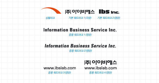
IBS’s symbol represents the image of a company that is faithful to the basics and pursues active change in the form of development extending from left to right, and is the spirit of IBS that contains the management philosophy of creating customer value by implementing human-centered informatization.
The font refers to a unique typeface that displays the name of a company and is the most essential element that forms the core of IBS's Corporate Identity Program, along with the symbol.
The font was developed in a modern sense, excluding decorative elements as much as possible on the premise of harmony with the symbol mark, and was proportionally adjusted according to each typeface and thickness, which means the proportion cannot be arbitrarily changed. IBS's symbol and font are in a combination of orange and black that best represent its corporate will to mature and intense enthusiasm, expressing the image of a reliable, young company.